
📍 United States
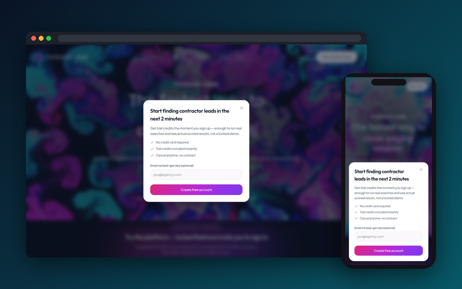
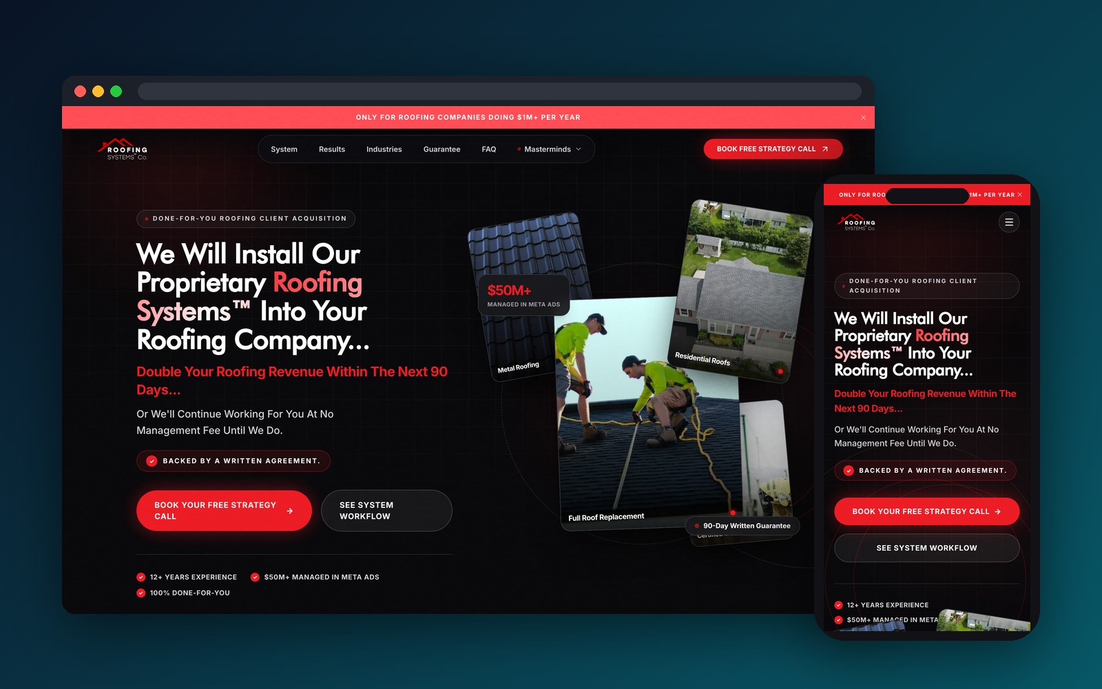
Production-ready design system with tokenized components, interactive micro-animations, and complete user journeys
Faster frontend development velocity using pre-tokenized design components
Consistent UI implementation across web, iOS, and Android platforms
Client engineering teams actively building software on top of Devsynx Figma tokens
SaaS and mobile products often suffer from inconsistent typography, mismatched button states, chaotic color palettes, and friction in developer handoff when design systems lack rigid tokenization.
Devsynx established a battle-tested Figma design system with tokenized color palettes, semantic typography, auto-layout components, interactive micro-animations, and comprehensive developer specs.
Detailed breakdown of the architectural modules, custom integrations, and software features shipped by Devsynx for Devsynx UI/UX Design System.
Purpose-built features tailored to Devsynx UI/UX Design System's specific operations and customers.
Instantly switch entire application dashboards between obsidian dark and clean white modes.
Precise spring and ease-out curves defined for button hovers, modals, and tab switches.
Every text and background color combination tested to exceed strict accessibility standards.
Every button, input, modal, and card is pre-mapped directly to matching React/Tailwind classes.
Modern frameworks, scalable databases, and secure APIs powering figma.com.

Devsynx turns complex software requirements into production-ready platforms delivered in under 30 days. Let's talk about your vision.